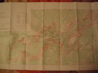


This is a Topographic map of Yosemite Valley National Park, California, 1970's.
The main peruse of the map is to show the elevations of the valley. It is using simple lines to express the different levels of altitude, though they don't exist in real life, so it is easier to read. This is the Law of Pragnanz that means simplifications in order to better express complex ideas. The lines that reflect the altitude and thus creates Layering in 3 dimensions, the first is the earth itself (Green plains, water marked in blue) and the brown lines are layered on top.
The principle of Proximity can relate to the closer lines that create the feeling of united areas where the earth altitude is raise or declined rapidly, but other reason can explain the same effect.
Regarding my view of the map, I don't particularly like it, the colors are doll and it does not provide the visual for what we thing of a National Park, it is hard to see that it is a beautiful place to take a hike, not even the front cover. Nevertheless I find it clear and easy to read, the Flexibility-Usability Tradeoff is what make it readable - the they "ignored" some of the altitude changes (flaxibale) to make the map more eefective. Is similar to the map we used to navigate in the army, so it has to be reliable :)
No comments:
Post a Comment