Monday, January 28, 2008

Project 1 - Alex n' Zack

What tasks are performed in the interaction and which are critical?
The tasks performed in lighting a lighter are minimal yet require a certain level of coordination in order to succeed in creating a flame. First, one must grasp the lighter with the thumb on the spark spindle and the other four fingers embracing the body of the lighter itself. Locate whatever it is you wish to light on fire close to the lighter and quickly press down with your thumb on the spark spindle while split seconds after using that same thumb to press down on the tab which releases the gas from within the body of the lighter. At this moment the combination of the gas and spark, if properly conducted, will create a suitable flame able to set whatever you wish ablaze. The critical task in using a lighter is the swift and confident thumb movement required to simultaneously release a spark and the gas to create the flame.

Why is this interaction necessary?
This interaction is necessary because if not for lighters, those needing a cigarette or other smokable item would have to use the somewhat unreliable and dangerous match or create a full blown fire and use it in the lighting of all cigarette, cigars etc...

What are the items of this interaction?
The items of this interaction include the fuel chamber in the body of the lighter, in some cases a flame size adjuster, the spark spindle and the tab directly below the spindle which releases the gas from the chamber inside the lighter.

Where and When does this interaction start and finish?
This interaction begins with the need for a smoke and continues with the proper use of the lighter by performing the described actions above. The interaction is complete with an achieved flame of desirable size and ability to light the chosen item.

How does the design direct the interaction?
Although people seem to instinctively know how to use a lighter, I am not so confident that someone who had never seen a lighter before would be able to use it. It is for this reason that I feel the design of the typical lighter does not perfectly indicate how to direct the interaction. For those who do know it is typically because we have witnessed numerous times how to successfully use a lighter. The spindle that creates the spark suggests a turning motion and the tab directly beneath it implies an immediate application of pressure in order for proper use. It is possible that the tab which remains a different colour on most lighters is designed in order to signify a need for movement in some direction and the grooves in the spindle also suggest a certain movement in order to create the desired flame.

What are the goals of the people in the interaction? How are these goals met or not met by the system?
The goal(s) of the people in this interaction is to create a sufficient flame in order to light common items such as a cigarette. Although using a lighter may be difficult at times, it is hard to imagine a different method of quickly acquiring a usable flame while maintaining a reasonable size for the product. In this sense the goals of the system are met if one is able to successfully pull off the required level of coordination in order to make gas and spark meet.

Diagram


Re-Design


Sunday, January 27, 2008

Exercise 5 - Zack Shields


An object that i love is my iMac computer. In the past i was a Pc user but i made the switch to Mac when i started at Ocad. Everything runs so much smother on a mac and i no longer see the "fatal error message " found in the Pc world. Not to mention no big cumbersome box/tower taking up space. The designers at Apple truly think about how the experience of using a computer should be. The child like simplicity of drag and drop function makes moving things around and opening applications a breeze. One function i absolutely cannot live without now is the Expose all windows button on the mouse. It allows you to see every window your working in to be seen all at once, then allows you to select the window you want. It great for when your working on a different projects at the same time. Say editing a video and writing an essay.

The Object i hate is my glue gun. Its main problem i suppose is that its cheep, its deffinatly not the deluxe model.I bought it becuse its small and i wanted it to be less messy. Well i was wrong, its very messy and glue always seems to drip out of it. The cheep metal stand quiclkly came off and is now long gone. So the glue gun now has to be layed on its side, which brings up another problem. The heating element getts way to hot and after 5 minutes or so can be hot enough to leave a mark on a wooden desk.The last thing that bugs me about the glue gun is its short cord. At only 47 inches the cord is always holding me back, even when its plugged in on top of my desk i feel like i could really use an extra ft. of cord

Exercise 5- Jenny Kassen

I LOVE, I HATE


My alarm clock is a nightmare of a design. Although a valiant effort was made to keep it simple and travel sized, as well as easy to use, many of its compositional elements simply end up being dysfunctional.
The organization of the clock face tries to utilize hierarchy, by grouping the three “time” functions underneath the digital clock, and the additional functions below that, the legibility of the text used to explain the functions of each button is so small and has so little contrast to the colour of the plastic, that it is almost impossible, at first glance, to know what to do with the controls.
The slide bars that control the extra control options, (that hold up to five choices, and are labeled both top and bottom), are constricted, but are also very sticky. This means that any late night, or absent minded alarm setting either ends up in the wrong category, (“2nd time, time set, calendar etc…), or not turned on at all. The interfacing is equally confusing. With only three quadrants in the screen, there is no reasoning behind the dispersing of the controls.


My coffee maker, on the other hand, is a work of art. Not only does it provide me with copious amount s of caffeine, but it involves minimal work or thinking.
The controls are split up according to the 80/20 rule. On the right hand side is a slider bar with “on” to the far left, “off” in the middle, and the “auto” function to the far right. (On and Off being the controls that I use, easily eighty per cent of the time.) On the left, clearly mapped and legible in type and contrast, are three buttons that allow the coffee maker to be pre set. Its accessibility comes in the form of visual feedback, a red light to signify the maker is on, in aural feedback, the sound of the coffee brewing, and in the raised buttons for each function. The affordance of the design is found in the finger indents, for where parts pull out, and on the raised ring on the heating plate, to make sure the pot is in its place.

Rob Exercise 5

love my drill, the overall mapping, and layout of the controls are easy and comfortable. The interface between user and tool are easy to understand. I have owned many drills in the past, and this one is by far the most powerful, without being overly awkward. As soon as you hold it, you can feel that it was built well, it has weight, but it is balanced. The most impressive aspect of the drill, is its battery, it holds a 24volt lithium ion, which is top of the line... so far...

I hate my key chain Knife/bottle opener. The blade became dull after only a few uses, and I have never been able to use the bottle opener easily. It was an attempt to combine two functions, and yet failed at both. When using it as a bottle opener, you are not given enough leverage to actually make its use convenient. And due to the awkward wide handle( which acts as the bottle opener), when trying to use it as a knife, it feels lose in your hands, and thus dangerous.

Nicole . Exercise 5

Design I Love – My Sealy “Auto off” Bed Heater

One design I love is my bed heater. I’m on my second one now and it is extremely important to me. Without this, I would not be able to sleep at night because I am always freezing.
The design is clever as it works as a fitted sheet for your bed, so it’s not a heated blanket that you would place on top of your body, but a full size heater attached to your mattress that you lye on top of.

There is a controller with different setting of heat levels that go from 1 – 9 and then H (high) being the hottest. The controller is also a good design as it automatically turns off after 8 hours of being on; therefore you don’t have to worry about remembering to turn it off in the morning.
It heats up in a reasonable amount of time (approx 7 minutes) and once your preferred heat setting has been chosen, it will remember and always turn on to that particular number (my preferred setting is high). It is washing machine friendly, it’s soft and puffy and the wires that heat up are small enough so you do not feel them while you sleep. Overall, the design of this bed heater is perfect for anyone who suffers from bad circulation and is always cold, or someone who just enjoys a warm bed to crawl into. I would die without it!!


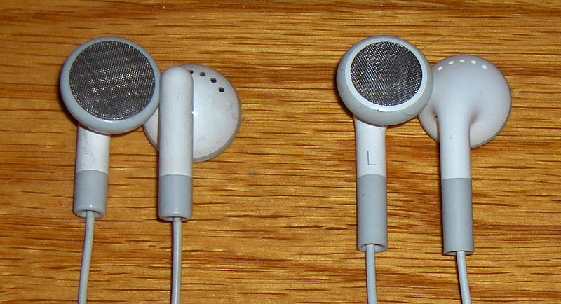
Design I Hate – Standard Earphones (the ones that come with your ipod)

One design I hate is the standard earphones that come with pretty much any electronic music players (they can also be bought separately). I dislike this design mainly because it absolutely never fits into my ears. I have small ears and trying to fit the earphone into it hurts and will fall out, making it useless to me and frustrating. This also forces me to go out and buy another set that actually fits which would be unnecessary if they fit properly in the first place. I think the design should be changed by making the speaker part much smaller, and then adding a squishy material that would be placed over top so that it could fit and conform to any size ear. I know other people who share the same problem therefore this is a common issue. This results in wasted earphones because I have about 7 pairs in a box somewhere that are not being used.

Exercise 5- Mark O.


The object I love is my phone, the Motorola Ming. It is a touch screen smart PDA style phone that provides an auditory as well as visual feedback every time a button is pressed. In terms of visibility it has an option which allows the user to easily change the order of the icons in the menu screen, in other words, it utilizes hierarchical organization so that the most important choices are seen first. For example, you can program it so that Messages, Recent Calls, Camera and Alarms show up first. This way you wont have to scroll down past useless applications such as FM Radio, Recorder, Tasks, etc (Applications rarely used). 

Position of the controls so that the behaviours correspond to the layout and behaviour of the device could not be more apparent since there are no "real" buttons except on, off, and volume control on the side. The rest of the options are operated through the touchscreen menu. This means that there are no single controls for multiple functions as seen in many phones. 


Exercise Five - Ann

An Object I Love, an Object I Hate


I love my roommate's stitch ripper.

It's used to cut the seams in garnments for altering or reusing the fabric. There is some bright red plastic at one end that covers roughly half the object, giving the user an obvious visual clue (read "map") that is the end you hold while using it.

There is also a tiny ball of the same red plastic covering one of the two metal points that surround the cutting blade. This point is there as a constraint so that it doesn't damage the outside of the piece's material. Since the ball is also much easier to see than the tiny point of metal it is covering, it aids in the visibility of the user's progress in ripping apart a seam. It also lets the user know that when the red ball is in between the two fabric panels, he or she is just cutting the stitches and not into the fabric. The fact that the cutting edge is surrounded is another constraint that forces the user to cut the stitch at a perpendicular angle, this means that it's much harder to damage the surface you're working (because the pointy metal isn't facing down) or poke you in the lap if you're working on the couch.

The spaces in between the stitches of seams are very, very small, and if you're using a razor or exacto-knife it is easy to cut too far, or miss the stitch completely, thereby ruining your garnment. The small point that has been left in its bare metal state is a key part of the usefullness of the design. It affords the user the ability to gently and delicately pull the seam apart before cutting the next stitch.


I consider myself a smart shopper, and don't buy
many things I end up hating, but these ice cube trays I got at No Frills are terrible. I was having people over the next night, and didn't want to buy ice, and these things were 2 for a dollar.

There's not much you have to do to map out an ice cube tray properly, you just have to ensure that there is more concave surface area on one side than the other. The designers of this object succeeded in that respect. But it makes crappy ice.

How can ice be crappy? Ice is ice, right? Well, I beg to differ. Ice is placed in beverages to make them colder, not to water them down (otherwise I'd be adding water to my scotch), which is the exact opposite of what the ice made from this particular tray does. The long, thin, shard-like "cubes" of ice melt at a fraction of the time of your standard ice from the tray that comes with the freezer. They stick out the top of shorter glasses. The partitions in between the individual ice compartments are too low, and this lack of designed constraint means that you can overfill the tray without overflowing it. When the tray is too full, the ice comes out as a ne big bumpy block, and the shallowness of the individual slots makes it impossible to break the frozen together pieces apart when it's done.

The "affordance" of making ice in less time (by making the shallower moulds) is overshadowed by the how cumbersome it is to carry the tray from sink to freezer without spilling any water. Every little spill can actually make you lose a significant portion of the future ice, because the tray holds much less water than your conventional ice cube tray thing. I now use these trays to mix paint for school projects. It does a pretty good job of doing that.

Exercise 5 - Alex Goldsmith

One of my personal belongings that I like are my Sony headphones. These headphones provide an extremely high sound quality and have not broken in any manner in the 5 years that I have owned them. Since these headphones are so simple they have high affordances as it is visually obvious as to where you put them on your head. The mapping on the headphones, the L (left ear) and R (right ear), make the correct placement of them on your head simple and allows for maximum comfort and outside noise reduction. These headphones also present no constraint in any manner, as the simplicity in its design and surprising maneuverability allow for a wide range of head sizes to comfortably sport the headphones.


One of my belongings and a design I hate are the old iPod earbuds that use to come standard with every purchase of an iPod mini, shuffle, photo etc... These earbuds were able to fit in my ears but very uncomfortably and after 10 minutes of wearing them my ears would hurt. Not only were they uncomfortable but they had terrible mapping as the L and R signifier would wear off after a couple months of use. In terms of affordance, these earbuds passed, however it does not make up for the ear pain and backwards usage after the left and right markers rubbed off. Although Apple released an upgraded form of their crappy standard earbuds they cost significantly more and I have yet to meet someone who bought those instead of paying a similar price for the headphones you see above.

exercise 5 - Banafsheh Pourpezeshk

An object i love ,an object i hate


an object i hate is my Motorola Pebl phone .It looks very fancy and interesting at first and i like the way it slides when you open it even though it is not a slide phone .The use of affordance's is very difficult to figure.there is a built in camera in this phone but it is not clearly noticeable and the resolution of the images that it takes are very low.there are issues with the mapping system of this phone.i am pleased with the physical constraints cause it covers the affordance's and keep you safe from paying extra for dialing accidentally!:)however the * key on this phone is designed to use for 2 action and that makes users life difficult ,when text messaging the * key is the affordance which is used as the space creator but also this key turns the ring style to the silent mood and it is not noticeable at all,so the problem after that would be the fact that you might miss your phone calls. also as it appears in the picture at the left side the affordance's are flat and there is no feel of buttons all you and feel are these lines that was design to separate the digits in a weired way.


An object i love is my Canon Power shot TX1 camera. it has an unusual both in its cine camera styling and its positioning as a hybrid digital camera /video model that offers HDTV movie capture with 10x stabilized zoom and all this in divided in IXUS /elph size body.The unusual vertical style is interesting but awkward to hold the camera when taking a picture. Elements are mapped very user friendly in this camera .The affordance's are very well designed and useful .There is an easy print affordance and makes the printing job much easier.The LCD is small but good enough for a small camera with all these facilities.

Exercise 5 -Amy Fong

An object that I like is my cup; it comes with a spoon that is attached to the cup to offer more convenience then other cups. The handle has a hole that holds a spoon so I can just use that spoon when I need to mix my drinks and put it back in the handle when I’m finished. Instead of carrying around a separate spoon using this cup saves me the task of going to the kitchen to place my spoon in the sink.

The affordance of this object; it serves as a cup and a spoon holder and the length of the hole in the handle is long enough to hold the spoon to avoid drips. There is one problem with this design, the handle is too close to the body of the cup so if I’m drinking something hot my hands will feel the heat, but luckily the material prevents too much heat from coming in contact with my hands.A physical constraint can be made to this project that prevents the body of the cup from coming too close with the hands and in order to do that the handle can be made further apart from the cup.
An object that I dislike is my waffle maker; it allows me to make delicious waffles but the process is quite difficult due to the design of the product. Mapping; the waffle maker does not provide a clear identification as to where the product is to be open to put the batter in. Also when I do find out where it opens I burn myself trying to open it after it I have made waffles in it because there is only a small piece of plastic (the black tab in the middle of the waffle maker) just enough for two fingers to flip it open therefore I get accidentally burned every time I use it.

However I love the aesthetics of this waffle maker; black and silver project a very sophisticated piece of electronic.

Exercise 5 - Adamn Oliver


Let's start with an 'object', and i use that term loosely, that i hate. I hate all DVD player programs on my computer. One of them, Nero Showtime came with the actual DVD drive and the Ati DVD player came with my video card. They are such horrible piece of poop designs. The image provided are the controls for both of them. In terms of affordance there are way too many options. It takes me forever to find the button for the root menu. In terms of visibility some of the buttons are really small and don't even have an image that represent their function. There is no constraint on these players the designers opted for a 'cool' looking interface and disregarded usability.

Now the player i love is Divx player. It plays most movie files on computers (.avi, .div, .mpg...) but was designed to play divx files. Divx is a format that was essentially created for best quality video with a smaller disc size (for downloaded movies!!!). It's interface is simple and easy to use there are really only four main buttons and it's very intuitive. The designers of this player definitely took affordance into consideration. When you are playing a movie full screen and then click the screen and mini version of the interface will pop up allowing you to move forward or backward stop adjust the volume, etc. My only complaint is that it doesn't play DVDs. Not only is it cheaper to download shows and movies than rent them but it's easier to watch them too. :)

Ex # 5 Love/Hate Design - Inbal Shreemohan


I really like our portable vacuum-cleaner; it’s easy to use, handy and does what it’s intended to do. The design of the product is smart, starting with the aesthetic; smooth looking, very flowing (although in my opinion lacking of color). The Visibility is clear, the handle is obvious and there is no dough to use your hand to grip it. The ON button is the fitting affordance for a finger, constructed in a way you would automatically place your finger there, and it is limited for the one finger you are not using for holding the handle, so constrains are there as well. When you push the button which is part of the affordance (it moves easily with a gentle push) it gives you an audible feedback as it starts working, so you know you can use it. I would place a visible signal to make the product usable to people with hearing problems.


A design that I do not like is my boyfriend’s HP mobile. There are many good functions but some issues as well. One thing I always struggle with is the keyboard, it is way to small for me, the affordance of this tiny push-button it not suitable for adult finger tips and make it peaty difficult to write a long massage. Another thing about the keyboard id the numbers; when ever I try to dial I have to look closely at the numbers; because the visibility and mapping of the numbers buttons is not good enough, It is colored in a darker grey but same shape. Last thing which my boyfriend always laughs at me but it still happens; the plastic protection screen on to of the screen it self isn’t visible, which is a positive thing until you try to click on the touch-screen through the protection screen… There should be a small symbol or texture on the side as a constraint.

Exercise 5- Heejin Son


I hate my printer. It is a printer with a scanner combined in one. This bulky printer doesn’t have a universal usability. The labels of the buttons are Korean; and, it includes many buttons which doesn’t have necessary options. Their mapping didn’t label clearly and it is hard to determine what to click when you perform a task. Also, it has low affordances. For example, when you try to use a scanner you can’t press the buttons from the printer. You have to open a program and start form there in order to use a scanner. Furthermore, the scanner won’t work if there’s no ink for the printer. This constraint makes the scanner useless when there’s no ink.


I love my small size desk fan. It is better than any other fan that I have used. It has designed very simple but has great capacity. It is very user friendly. It only contains few buttons and they are clearly visible. Its physical mapping is pretty straight forward. Although it has some contraints, it's all for safety reasons. Its inside has covered up with plastic cover and it could not be removed or touchable.


Exercise 5 - Song Kim


I hate this object - Kenmore Plastic Kettle
I don't like this object because although it is a simple, clean design the material can not be broken down, it is just a big chunk of plastic, so we can not recycle. Also, I think this design is too simple. The affordance and physical constraint of this design, the one red switch - (On/Off) is quite effective and limits the range of possible action. However, the aesthetic part of this design lacks some important context. The handle is too wide, uncomfortable to pour water,especially the handle is on the top of the bottle. No cover or lid-can not wash inside of the kettle. No appealing design and most of all, no clear plastics- so we don' t know the water level.
I love this object - Ultra Slim Ceramic
This slim and light weight hair straightner is really a good design. It can hold hair firmly, automatic shup off system (keeps the heat at certain level ) and the grips - made in right position so physical constraint of this design is quite effective (make it more safe). Also the visible feedback is good. I really like this color match - golden ceramic plates with black and siver plastics.


Im pretty much a water alcoholic. I carry around bottles of water where ever i go. When I found out that the plastic water bottles were really bad for you and I switched to Voss water. Not only does the water taste great, you can re-use the bottles. Due to its wide top its really easy to wash.I also love the design of the bottle. Its really simple and makes the water appealing. If I could change anything I would change the plastic top of the bottle. Also its sometimes annoying to carry around with you, because the glass is pretty heavy. They could of used thinner glass, but then it would break easily. Also its not a universal design.

As nice as these ice trays (with the shapes) make the ice look in your glass, they are very annoying to pop out and the fact that u place it in the freezer and there is no lid really grosses me out. Its not made to be able to be used by everyone so it is not a universal design. Also the one that i have is not great plastic, its not environmentally.

I love my iron. I had old one from same brand but that one did not used to work well. I used to have some kind of problems with pressing clothes for some reason. Some times I used to burn my clothes or some time I was not able to press them properly. I love this iron because the mapping of the buttons and the placement of ever function is amazing. It fits in the hand properly. Its very light weighted. It gives me visible and audible feed back by showing me the heat setting on the small screen on the top and also by the sound. This object is based on physical constraints so i can change the heating, steaming setting when ever i want by pressing the buttons when i needed, and these affordances are very clear with diagrams, which helps me so much.


I hate my exactoknife sooooo much....i got big horrible cut with this knife. The affordances is clear but it doesn’t stop and lock, the blade keeps coming out and the blade is not strong at all. It breaks easily and does not cut straight because of the flexibility of the blade. It doesn’t give me any visible feedback. The physical constraint should be improved.

Exercise 5 - Emily


I love this alarm clock, it has all of the features you need in an alarm clock and none of the features you don’t need. The mapping is very well done. The buttons on the top left and top right control the hours and minutes, respectively, which makes sense because hours appear on the left side and minutes on the right. The snooze and light button is the large button on the top of the clock, which is pretty habitual, users are used to having snooze button on top with conventional alarm clocks. The dial on the face of the clock has four options: alarm off, alarm on, set time and set alarm. This constraint makes this clock very simple and void of any confusion. To set the time or the alarm, you simply turn the dial to the appropriate position and use the hour and minute buttons. To turn the alarm on or off, you set the dial to the alarm on or alarm off positions. Another great thing about this clock is that it is extremely portable, the stand that it sits on folds in to cover the dial, so you can transport it without accidentally changing the settings.


I hate this alarm clock. Besides that fact that it’s super bulky, gets dusty really fast and is unstable on a table (it tends to roll, which often triggers one of the sound buttons), it is really confusing to use. There are way too many buttons, options, and settings, and this lack of constraint makes it very complicated for the user to accomplish a simple task. The mapping is also very poorly done; the buttons do not visually correspond to their function so they all have to be labeled. To change any of the settings the user has to press the ‘mode’ button numerous times until they find the setting they want to change. Then they use the ‘select’ and ‘set’ buttons to select the object they wish to change. Some feedback is provided here because the selected area flashes. To set the alarm, the toggle switch on the top left has to be set to ‘sleep’. Then the user must press one of the sound buttons and adjust the volume. Once the sound is playing, the user flicks the switch to the ‘auto’ position to set the alarm. This is a very confusing process for a new user and there are no affordances that direct the user to go through this process. Overall, it is nearly impossible for a new user to figure out how to use this alarm clock unless they read the instruction booklet.


Exercise 5-marlissa flint


I love my ziploc bags. I use them for everything (food, money, pens, pencils, jewellery etc.) i love to re-use them so they are seldomly recycled. I love the audible feedback that they give, with the snapping sound which lets you know that they are being sealed nice and tight. I also recieve visual feedback. the bag lets you know when its sealed because you can no loger see the pink and blue stripes. when its locked the two colours blend together so you can only see the purpleish one. that means its locked. affordances are very clear. there is only one possible way to reach the contents of the bag, which is the opening at the top.

An object that i hate is my rice cooker. its made by a company called salton. i use this rice cooker very often, about 4 days a week and every time i use it its a guessing game. the cooker has only one button. above the buttons there are two options. one that says "warm" and one says "cook". they each have a different light the warm is yellow, and the cook is red. when you first start cooking the rice, you push the button down and it starts to cook. whenever the cooker chooses, it switches to warm and the rice stops cooking. however, the rice is NEVER fully cooked when the "warm" light goes on. there is no audible feedback to let you know that the rice has stopped cooking so you have to keep checking to make sure the rice is still cooking. also, the cooker allows for a wide range of rice which require different cooking times. the cooker does not take this into consideration. unfortunatley the only affordance is the one button which lets you cook and re-cook the rice. the mapping is not very good at all because it doesnt tell you how many times you have pressed cook so without looking at the rice itself, you would never know if the rice is atually done. perhaps if the thing had different settings for different rice levels and different types of rice it may be able to stop cooking when the rice is in fact done. also, a "ding!!" or a "beep!" may also be helpful.

Love/Hate - Eve Zorawski

Object I hate: IKEA Folding Chair

I don't usually hate things, but my IKEA spare folding chair is very difficult to love.

The Design is ve
ry basic and suggests an easy unfolding/folding process. Theoretically, this structural shape should be able to sustain at least 60kg as well. Unfortunately, the mechanics, cheap fabrication and poor location for grips, do not guarantee any of these basic expectations.

The affordances in this design have not been successful. Generally, unfolding chairs have seats that are already attached to the legs, thus making unfolding very simple and quick. Unfortunately, with the IKEA unfolding chair, the two inner corners of the seat are not attached to the legs. There is, though, a hook on
both corners which works to help map their designated place (the hooks are shaped exactly for the metal tubing) and preventing the chair legs from slipping.

But the grips do not always work, resulting in the user flat on the ground in a bundle in plastic and metal tubing. An improved physical constraint is definitely necessary. Perhaps replacing the hooks with rings, so that there are no more "slips", literally!

Object I love: Corkscrew of the Future

I really appreciate my (relatively) new corkscrew. I have used many corkscrews, and this one requires the least amount of force and proved the process to be a lot faster and simpler (and much less tedious) than most corkscrews. Unfortunately, the visibility of the parts is not quite clear. This makes familiarizing yourself with the object somewhat difficult. I suggest better mapping of the necessary steps to complete the opening process. As well as improving the signal-to-noise ratio, by making the coupled handle (first step) larger so the user will be more likely to grab them first and be less distracted by the handle above (last step).